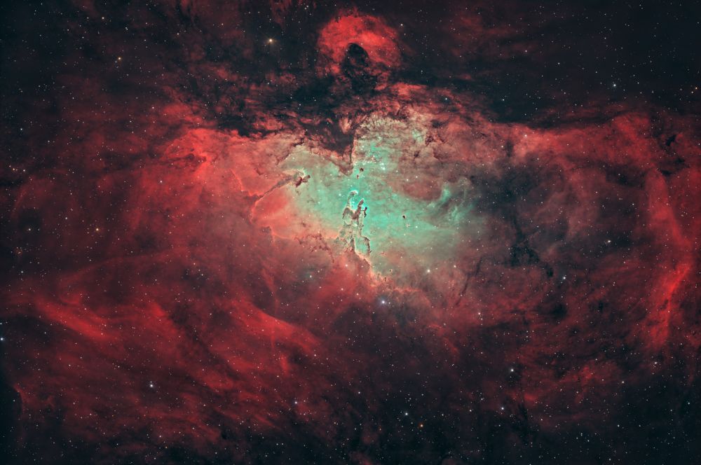
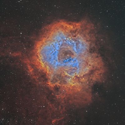
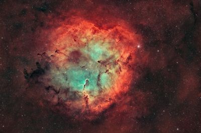
The processing is good, but... Don't you think the color palette is a bit off? The light green with dark red doesn't look right. It's not quite working. There's no sense of depth, and the Pillars look pasted on. Maybe add a bit more blur and balance the colors? For me, I'd add just a touch more blue. That's just my personal take. Maybe you see it differently...
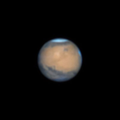
Thank you! The blue will be in a different palette when I finish capturing the Sii data. I didn't do anything special with the pillars; I don't see what's wrong with them. I don't understand why this particular palette bothers some people. The real colors of hydrogen are a red hue (burgundy), and oxygen is green (emerald). For example, like in the photo of the Dumbbell Nebula M27.
You may be right. However, in my understanding, we amateur astrophotographers capture beauty, not real colors. And emerald green, by the way, has shades ranging from yellow-green to blue-green. https://star-hunter.ru/m27/ — that's the Dumbbell Nebula, and its color is a bit different from your photo. I'm more drawn to the Hubble palette, where oxygen is blue. Shades of blue give an image more depth than green does. That's why I mentioned the Pillars lacking a sense of volume. Again — this is just my perspective.
26 Jan, 2024
Reply
Comments are available only to registered users. Register or log in to leave a comment.

Comments
Comments are available only to registered users. Register or log in to leave a comment.